
Decorating With Original Architectural Watercolor Paintings
Table of Contents
- Why Architectural Watercolor Paintings Transform a Room
- How to Choose Art for Your Home: A Practical Framework
- How to Hang Watercolor Paintings: Placement and Display
- Watercolor Art Gallery Wall Ideas: Mixing Styles and Stories
- Protecting Watercolor Paintings From Sunlight and Moisture
- Room-by-Room Styling: Where Architectural Watercolors Shine
- Color Coordination: Making Your Watercolor Work With Your Décor
- Frequently Asked Questions
Last Updated: October 14, 2026
Why Architectural Watercolor Paintings Transform a Room
Decorating with original architectural watercolor paintings brings something no mass-produced art can: authentic stories captured on paper.
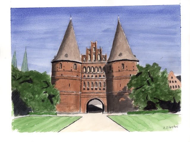
At Zachary Zleetni Art, we create watercolor paintings that capture the unique character of streets, structures, and stories from around the world.
The magic happens because watercolor itself has personality. Water and pigment interact to create subtle variations in color and tone that prints cannot replicate, and light hits paper differently than canvas.
This is why decorating with original architectural watercolor paintings changes how a room feels: it's not about filling wall space but creating atmosphere through authentic, handcrafted art that reflects both the artist's vision and your own story.
How to Choose Art for Your Home: A Practical Framework
Choosing the right piece starts with honest self-assessment. The best choices match three things: your personal connection to the subject, the scale and color palette of your space, and your decorating style.
Think about what draws you: European architecture, Mediterranean villages, historic American buildings? The strongest collections start with genuine preference, not what you think should look good. When you choose art based on what moves you, it shows.
Matching Your Personal Story and Travel Memories
The most meaningful pieces connect to your life. A watercolor of an Engadin house from a summer in Switzerland becomes a memory on your wall, and a painting of a city whose architecture you loved anchors your home to that experience.

You don't need to have traveled to every location in your collection, but the subjects should resonate personally. A watercolor of a city you've always dreamed of visiting can serve as inspiration or simply as art that speaks to your aesthetic sense.
When you select pieces this way, your home tells your story, visitors learn something about your travels, interests, and sense of beauty.
Evaluating Scale, Color, and Style for Your Space
Before you commit to a piece, consider how it fits your room. Walk around your home and note the wall space you want to fill, a small accent wall or a large statement spot above furniture. Size matters enormously.
A small watercolor (typically 8x10 or 11x14 inches) works beautifully in intimate spaces: bedside tables, hallway corners, small studies. A medium piece (16x20 or larger) anchors a living room wall or bedroom.
Color coordination is equally important.
Consider also the painting's mood. A loose, impressionistic watercolor feels different from a detailed, realistic rendering. Both are valid, the question is which matches your space and personal style.
| Consideration | Small Spaces | Medium Rooms | Large Rooms |
|---|---|---|---|
| Ideal painting size | 8x10 to 11x14 inches | 16x20 to 24x30 inches | 24x30 inches and larger |
| Best placement | Accent walls, hallways | Above furniture, focal walls | Statement walls, gallery areas |
| Frame style | Minimal, simple frames | Medium frames with matting | Bold frames or salon-style |
| Color impact | Subtle, supporting role | Balanced with décor | Dominant visual element |
How to Hang Watercolor Paintings: Placement and Display
Proper placement makes all the difference between a painting that feels at home and one that looks like an afterthought. The right wall, height, and spacing transform how your art works in the room.
Finding the Right Wall and Height
The best wall is one where natural light and sightlines work together. Avoid direct sunlight and choose walls where the painting is seen regularly and lighting is soft and indirect.
Eye level is the standard rule: hang the center around 57-60 inches from the floor. Adjust for furniture, above a sofa, the piece should sit in a seated viewer's sightline; in an entryway, at standing eye level.
Test the placement before committing: outline the frame with painter's tape, step back, walk the room, and live with it for a day. This prevents the frustration of hanging, then rehanging.
Spacing and Anchoring Your Piece
A single architectural watercolor often works best as an anchor, a focal point that grounds a wall or furniture arrangement. Center it above a sofa, console table, or bed to create visual balance.
If you're hanging multiple pieces, leave consistent gaps between frames, typically 2-3 inches for smaller pieces, more for larger works. The space between paintings creates rhythm and prevents clutter.
Use quality hardware. Watercolors are lightweight, but picture hooks rated for your frame's weight keep the frame level and secure.
Watercolor Art Gallery Wall Ideas: Mixing Styles and Stories
A gallery wall built around architectural watercolors creates a curated, intentional look. The key is balancing cohesion with variety.
Creating Cohesion Across Multiple Pieces
Start with a unifying element: a consistent frame style, a shared color palette, or a common theme such as all European architecture or all street scenes. That element ties disparate pieces together visually.
Alternatively, let the watercolors create cohesion through their shared medium and subject matter, architectural paintings naturally complement each other through echoing tones, windows, and stonework.
Arrange pieces before hanging: lay them on the floor or use painter's tape outlines, trying a grid for modern spaces, an organic cluster for eclectic rooms, or a linear arrangement for contemporary homes.
Combining Architectural Watercolors With Other Art
Architectural watercolors work beautifully alongside other art: pair them with black-and-white photography for contrast, mix in abstracts that echo their palettes, or add smaller sketches between larger works for rhythm.
The secret is restraint. Limit your mix to 2-3 complementary art forms; if combining watercolors with photography, keep the photography consistent, all black-and-white or all color-matched to your watercolors.
Personal mementos work too: a framed map of a city displayed near a watercolor of its architecture, a travel ticket, or a pressed flower makes the gallery wall tell your story.
Protecting Watercolor Paintings From Sunlight and Moisture
Watercolors are delicate: sunlight fades pigments, humidity warps paper, and temperature swings stress fibers. With proper protection, your original watercolor paintings remain vibrant for a lifetime.

Framing, Glazing, and Matting for Long-Term Preservation
Professional framing is the foundation of preservation.
Matting protects the paper's edges and creates visual breathing room. Acid-free, archival-grade matting is essential; cheap matting contains acids that yellow and deteriorate the paper over time (Preservation of Knowledge, Part 1: Paper and Microfilm).
The frame matters too: wood adds warmth and traditional elegance, while metal suits contemporary spaces. Choose frames that complement your décor while protecting the matting and glass.
Never frame a watercolor directly against glass without matting. Paper touching glass invites moisture damage and makes the painting feel flat. The matting creates separation and allows air circulation.
Room Conditions and Placement Away From Hazards
Humidity is watercolor's enemy. Aim for 30-50 percent relative humidity; basements and bathrooms fluctuate wildly, while climate-controlled living rooms and bedrooms are ideal (Storing Your Books - Preserving Your Books).
Keep watercolors away from direct sunlight, heat sources, and damp walls. Avoid walls prone to condensation and spots near radiators, air vents, or windows with dramatic temperature swings.
Temperature stability matters too: consistent, moderate temperatures protect paper fibers and prevent warping.
In a very humid climate, a small dehumidifier in the room where your watercolors hang protects your art.
Room-by-Room Styling: Where Architectural Watercolors Shine
Different rooms call for different approaches. Understanding how architectural watercolors work in specific spaces helps you choose and display them effectively.
Living Rooms and Entryways
Living rooms are the natural home for statement watercolors, with prominent wall space, good lighting, and regular foot traffic. A large architectural watercolor above a sofa becomes a conversation starter and focal point.
Entryways benefit from watercolors that set the tone as visitors enter, a historic European building or charming street scene creates immediate warmth.
Lighting in these rooms is typically good, so the full visual impact of original watercolor paintings, subtle color shifts, brushwork, paper texture, becomes visible and appreciated.
Bedrooms, Studies, and Personal Retreats
Bedrooms call for a more intimate approach: smaller to medium watercolors work better than statement pieces.
Studies and home offices benefit from watercolors that inspire focus, a historic library, university building, or quiet street scene.
Personal retreats, reading nooks, meditation spaces, quiet corners, deserve thoughtful choices. Watercolors with calming palettes and peaceful subjects, like a quiet courtyard or serene facade, support the room's purpose.
Lighting in these rooms is softer, which works beautifully with watercolors that reveal new details in gentle, indirect light. Avoid spots where lamps create glare on the glass.
Color Coordination: Making Your Watercolor Work With Your Décor
Start by identifying the dominant colors in your watercolor.
Neutral walls are the safest backdrop: soft whites, warm grays, and gentle beiges let the painting be the focal point.
Furniture coordination matters equally: a warm gray sofa pairs with similar gray tones, and wood tones pair with warm ochres and siennas.
Accent colors, throw pillows, decorative objects, can echo colors from your watercolor. If the painting features a blue-toned sky, blue accents elsewhere tie the look together.
Natural light affects color: morning light warms cool tones, afternoon light cools warm ones.
Bringing architectural stories into your home transforms more than walls, it changes how you experience your space. At Zachary Zleetni Art, we create original watercolor paintings that capture the unique character of buildings and streets from around the world. Each piece is available as an original artwork, with custom commissions also available to create paintings of locations meaningful to you. Our collection includes works like the Engadinerhaus Watercolor and Jefferson Market Library watercolor, each bringing authentic artistic touch to your home.

Frequently Asked Questions
How do you choose art that suits your home?
Start by considering the room's purpose, existing color palette, and the scale of your wall space. Original architectural watercolor paintings work best when they echo colors already present in your furnishings or complement your décor without competing for attention. Think about what story you want the piece to tell, whether it's a destination you've traveled to, a building that inspires you, or simply an aesthetic that draws you in. Zachary Zleetni Art's country-themed collections make it easy to find pieces that resonate with your personal heritage or travel memories, giving the artwork genuine meaning beyond its visual appeal.
How should you hang a watercolor painting in a room?
Mount your watercolor at eye level, roughly 57 to 60 inches from the floor to the center of the frame. On a wall above furniture like a sofa, keep 8 to 10 inches of space between the top of the furniture and the frame. Use appropriate hardware rated for the painting's weight, and ensure the wall can support it securely. For original watercolor paintings, avoid direct sunlight and areas prone to moisture or temperature swings. Proper placement protects your artwork while creating visual balance in the room.
Can architectural watercolor paintings work in modern interiors?
Absolutely. The loose brushstroke technique and atmospheric quality of watercolor paintings complement modern minimalist spaces beautifully, creating visual interest without clashing with clean lines and neutral palettes. Architectural subjects, windows, arches, doorways, and historic buildings, add character and depth to contemporary rooms. The key is choosing pieces with a style that aligns with your décor; pieces with realistic detail work well in traditional spaces, while looser, more impressionistic interpretations suit modern environments. Zachary Zleetni Art's diverse collection offers both approaches.
How do you protect original watercolor paintings from sunlight and moisture?
Use UV-protective glazing in your frame to filter harmful light without altering color perception. Keep watercolors away from direct sunlight, exterior walls, bathrooms, and kitchens where humidity and temperature fluctuate. Avoid hanging them near radiators, air vents, or windows. Choose a frame with acid-free matting and backing to prevent deterioration over time. Proper framing and thoughtful room placement are the most effective ways to preserve the vibrancy and integrity of your original artwork for years to come.